Across more than 40 countries, there are over 15,000 publicly traded companies.1 If you listen to the news, however, some countries may seem like better places to invest than others based on how their economies and stock markets are doing at the time. Fluctuations in performance from year to year only add to the complexity, providing little useful information about future returns.
Investment Opportunities Exist
Daunted by the prospects of sorting it out, some investors look to the place they know best—their home market. There can be good reasons, such as tax benefits, for prioritizing an investment close to home, but too much home bias could mean underweighting or missing out on part of the investment universe.
Australia, for example, represents 2% of the global equity market. An Australian who aims to build a global equity portfolio may have cause for investing a greater amount at home. However, this would come with a tradeoff of reduced investment in other countries. The same is true for a Japanese investor, whose home country represents 8% of the global equity market. Even the US market—the world’s largest—is only about half of the global opportunity set.
Reading the Checkerboard
Equity markets process information continuously, leveraging knowledge from millions of buyers and sellers each day as they set security prices. Investors can trust market prices to provide an up-to-the-minute snapshot of global investments.
Because prices do such a good job incorporating information about securities in every market, they also offer the best prediction of future prospects. No sensible story or compelling empirical research suggests investors can consistently outguess those prices and pick winning countries. A well-diversified global portfolio can help capture the returns of markets around the world and deliver more reliable outcomes over time.
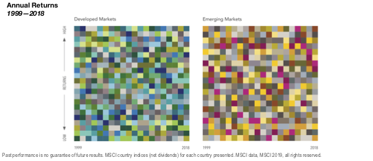
The tables in the image above illustrate 20 years of annual equity returns for developed and emerging markets. Each color represents a different country. Each column is sorted top down, from the highest-performing country to the lowest. Taken together, these tables powerfully demonstrate the randomness of global equity returns. In either table, pick a color in the first column and follow it through to the right. Does any country seem to follow a pattern that gives clues about its future performance?